Open & Elegant Sellersville Kitchen & Family Room
Project Overview
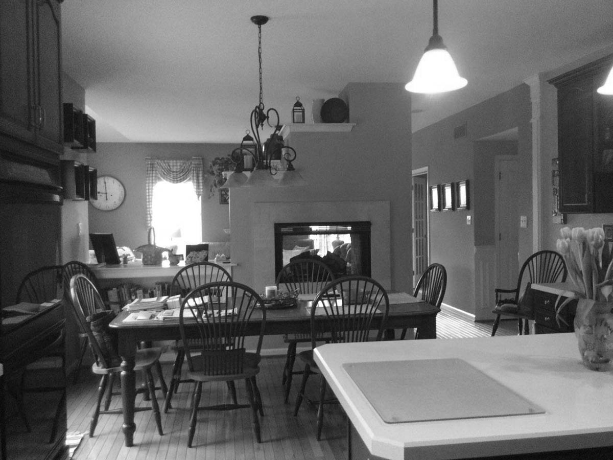
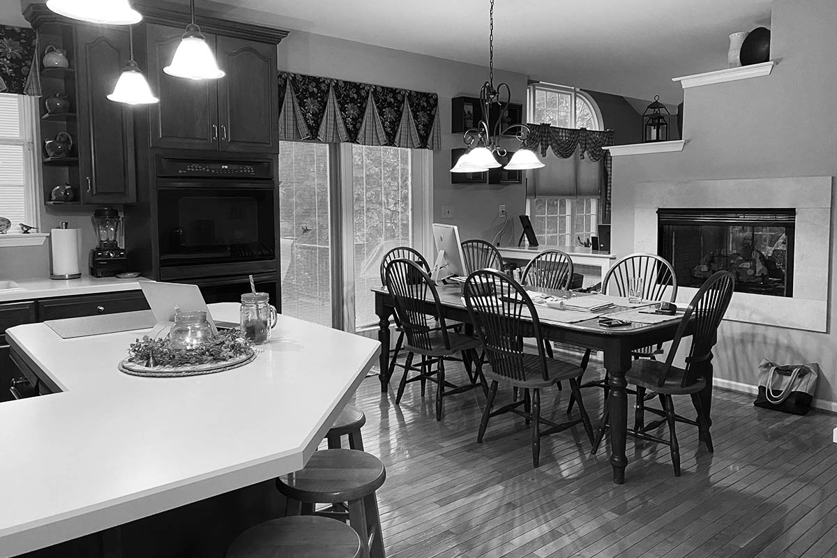
This Sellersville kitchen was likely a stylish and amenity-filled haven when the home was built, but it needed some work to bring it into the modern era. It boasted a center island with seating and storage and had a double wall oven — a great convenience when entertaining. It even featured a fireplace that surely added warmth to family meals.
Unfortunately, that fireplace’s wall disconnected the room from the rest of the house, making it feel small and cramped. When friends and family visited, they were either all in one room and feeling crowded or split between the kitchen and family room and feeling disconnected. Furthermore, the seating around the island faced the range wall, making conversing with a large group difficult. Along with these entertaining obstacles, the whole room felt dark and dated, not the expansive, airy, light-filled culinary oasis that today’s homeowners seek.
The homeowners reached out to Custom Craft for a much-needed facelift to update and brighten the heart of their home and transform their first floor into a welcoming place to gather.
Slide for Before and After Comparison
DESIGN Process
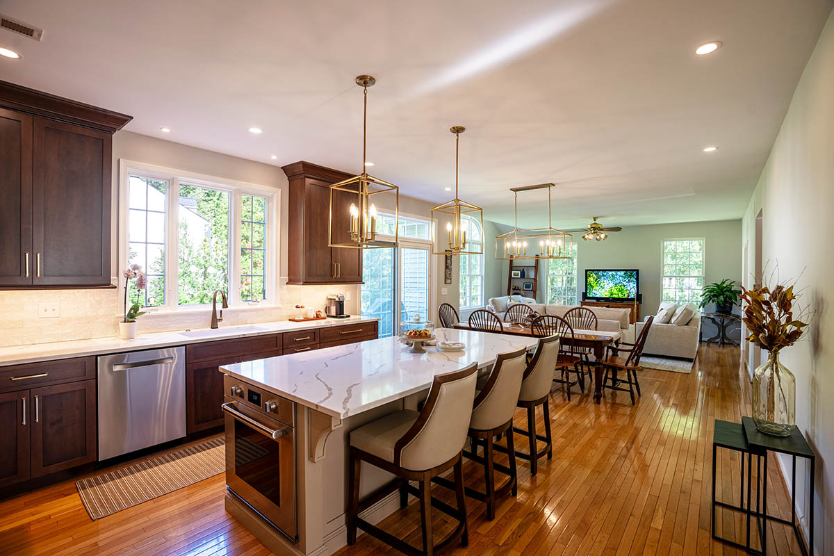
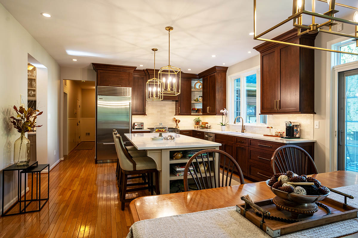
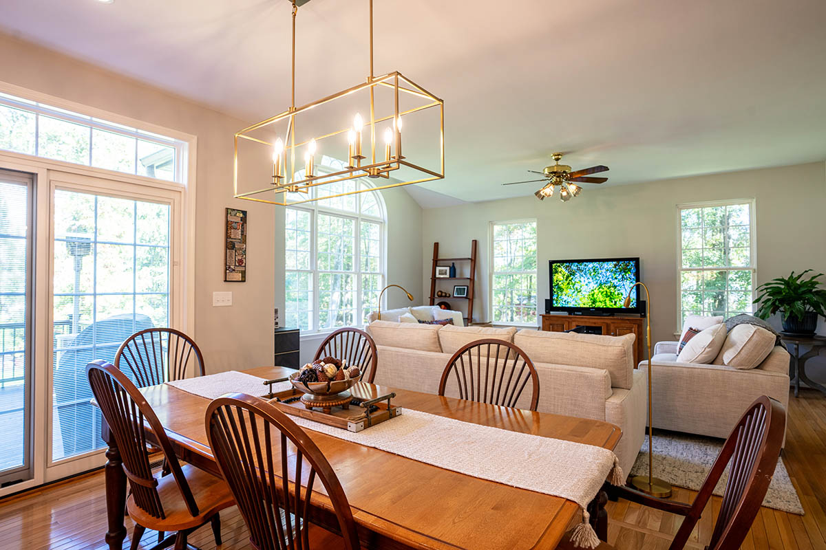
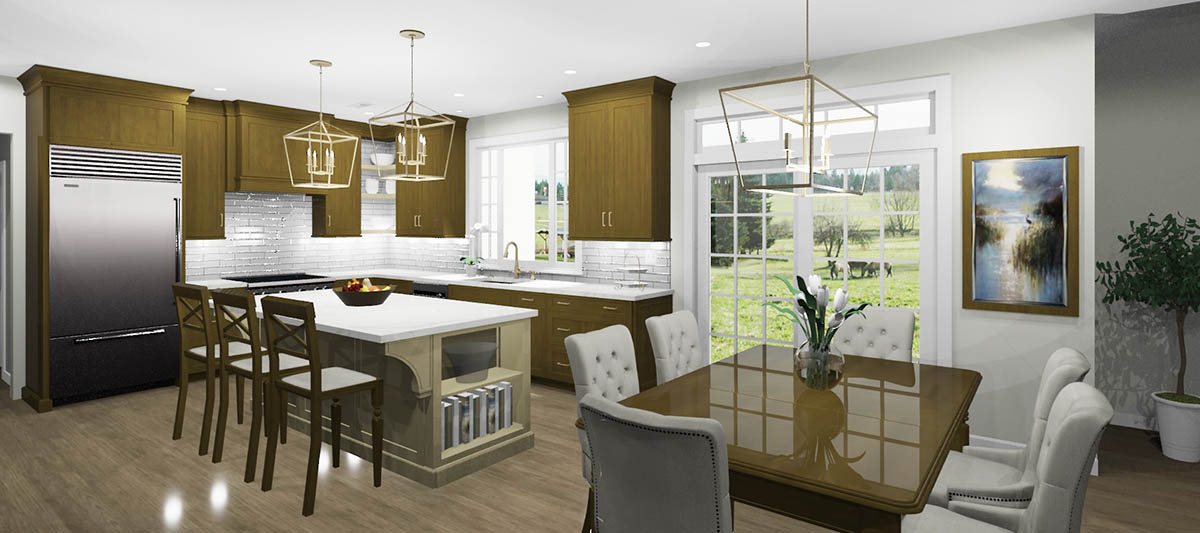
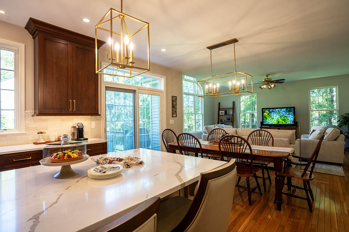
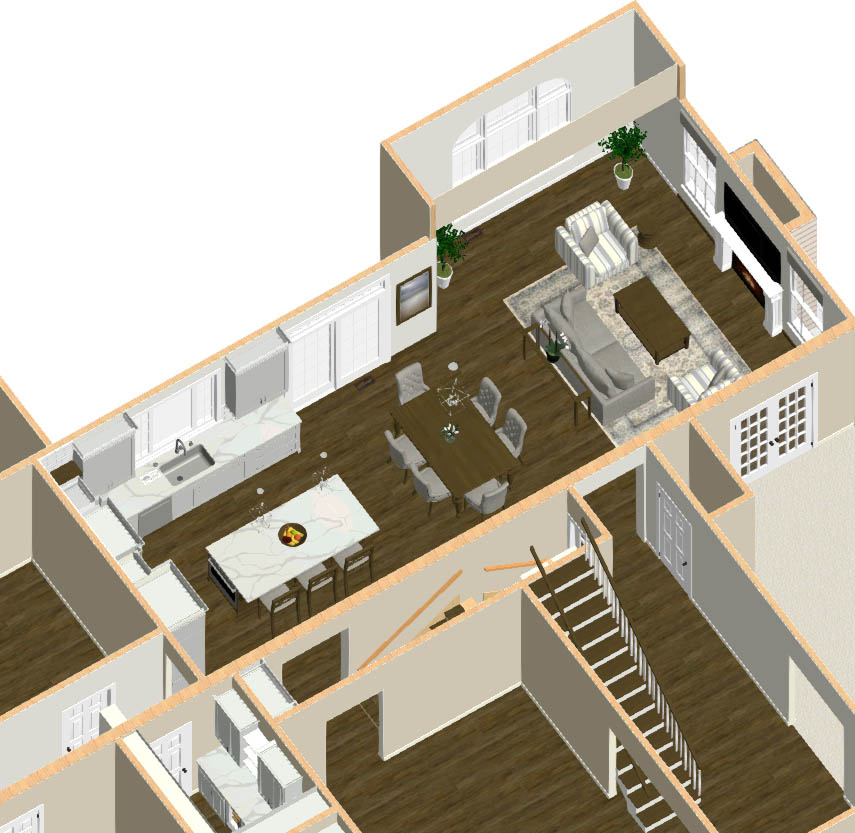
The Custom Craft team turned their separated spaces into one open-concept area by removing the decorative wall between the kitchen and the family room. This not only made the first floor feel lighter and brighter but also made room for a bigger, better island.
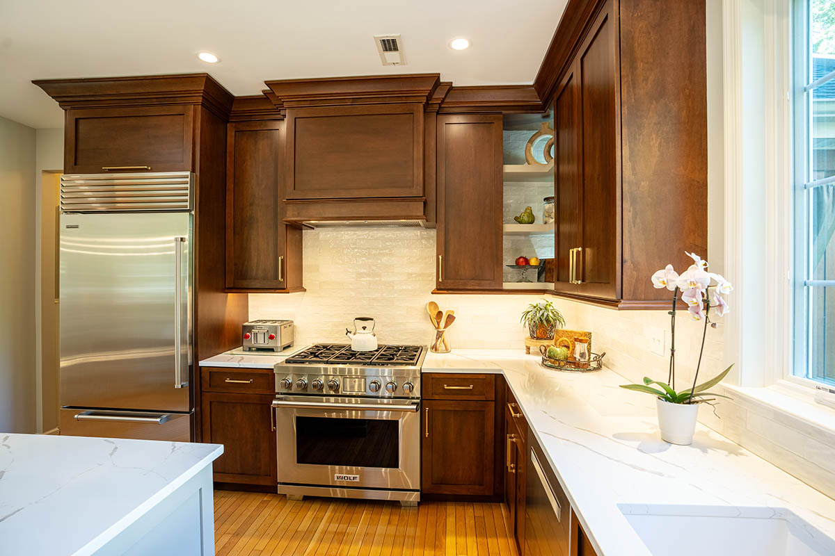
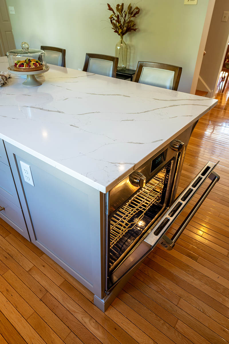
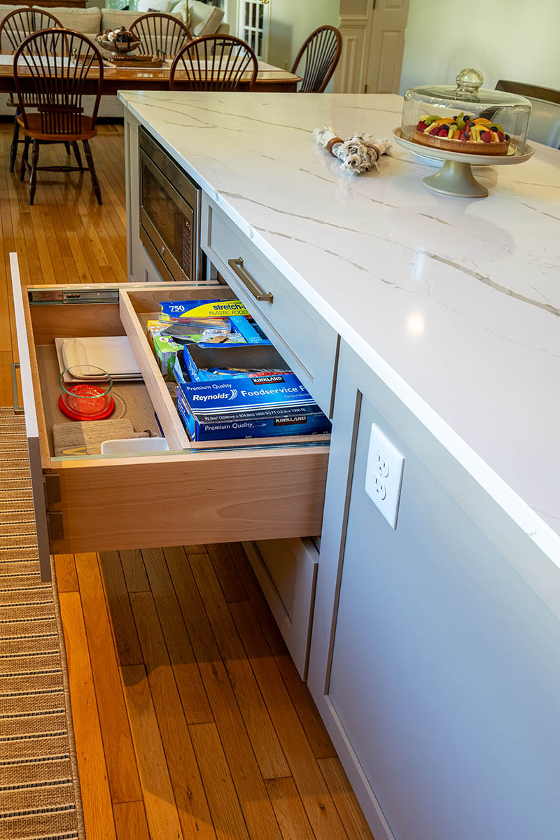
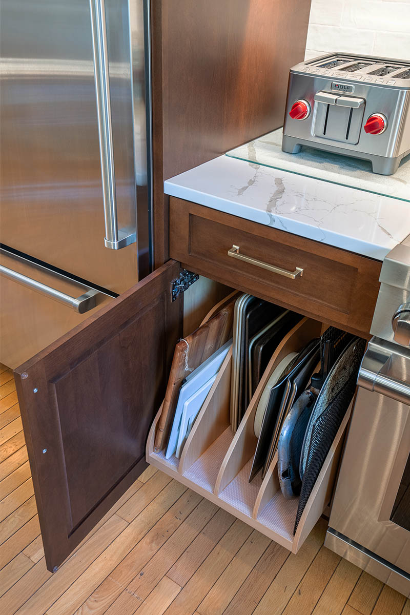
The new island has plenty of room for the family to sit and eat together. It’s also the perfect prep area, discreetly housing a built-in secondary oven, microwave, and plenty of drawer storage. While the taupe base of the island contrasts the rich, dark brown outer cabinets, the gorgeous Calacatta Hanstone quartz countertop matches the counters around the perimeter. The new upper cabinets reach the ceiling for maximum storage, and the drawers below have racks to hold pans and bakeware neatly. Also adding to the elegant new look is the white, glazed ceramic tile backsplash and a cool, mist-gray paint color on the walls.
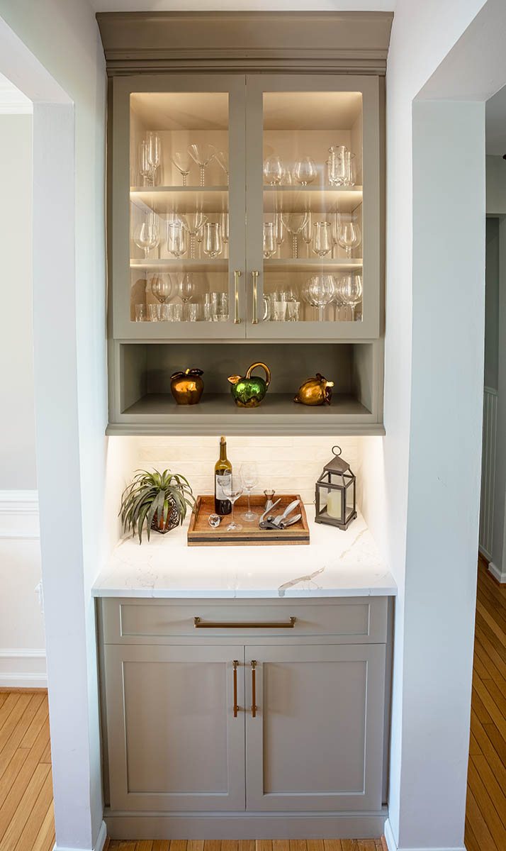
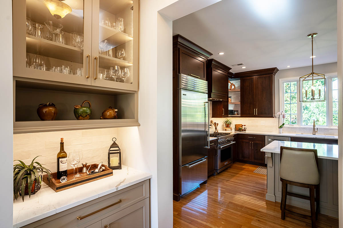
Our clients also decided to include a chic wine station between the kitchen and dining room. Now, guests can help themselves to a glass of wine or cocktail without contributing to foot traffic in the kitchen.
Ready to start a conversation?
Let's Talk
Complete this form to share some details about what you have in mind. One of our team members will respond to your inquiry promptly.

Navigation
Contact Us
Get Connected
Copyright © 2025 Custom Craft Contractors. All Rights Reserved. | Registered PA Home Improvement Contractor 005292

