Light & Lovely Souderton Master Bath Refresh
Project Overview
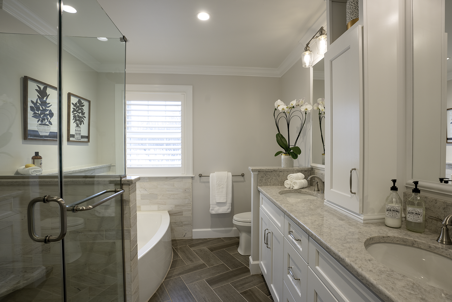
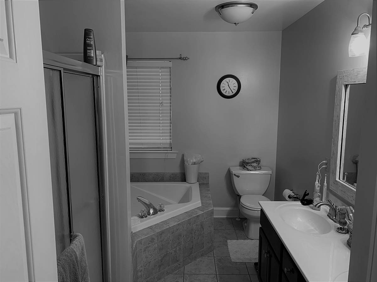
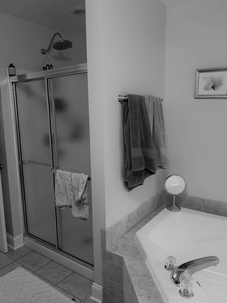
These Souderton homeowners contacted us to update and refresh their dark and dated master bathroom with a new look and layout that better met their needs. The goals in this project were to:
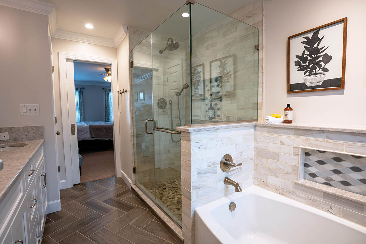
• Put in a smaller tub that consumed less water
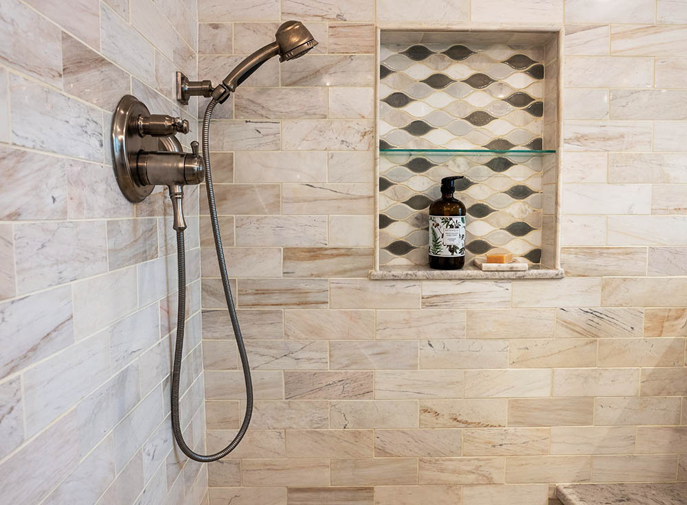
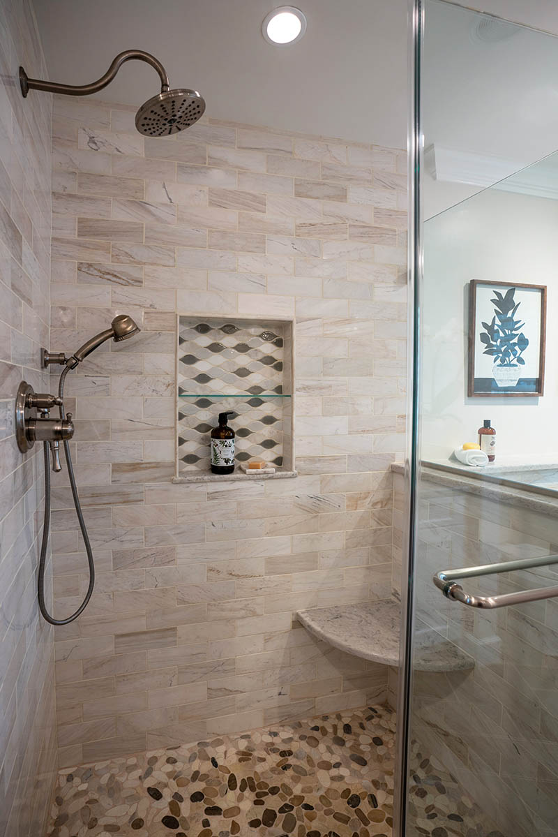
• Create a brighter, more spacious shower
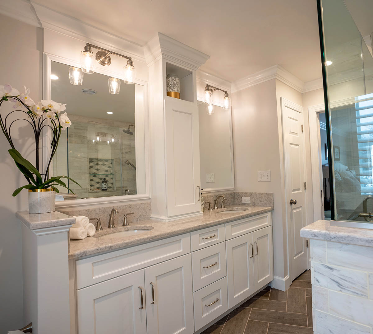
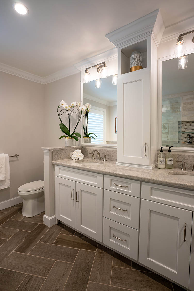
• Add more storage and better lighting
• Craft an updated, inviting space to relax and unwind
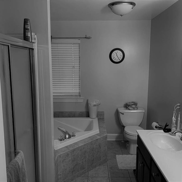
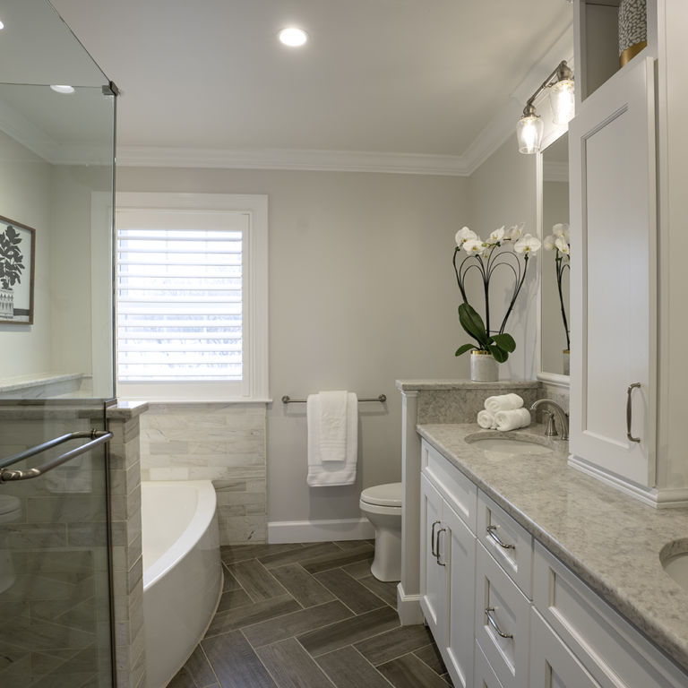
Slide for Before and After Comparison
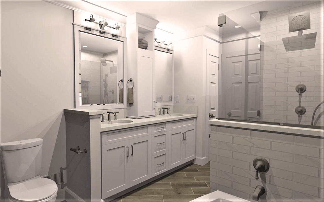
DESIGN Process
The oversized tub was removed and replaced with an elegant, curved alcove tub. With the newfound space, there was room for a spacious shower with glass walls to let in natural light. The upper portion of the wall dividing the shower and tub was removed, making the space feel more open and bright.
The new double vanity has lots of functional storage, including a center countertop cabinet that keeps the bathroom organized and clutter-free. Convenient outlets let homeowners easily plug in their electric toothbrushes, razors, and hairdryers right where they need them.
The added lighting, modern fixtures, and gorgeous tile flooring all work together to make this space a serene, spa-like oasis these homeowners are sure to enjoy for years to come.
Ready to start a conversation?
Let's Talk
Complete this form to share some details about what you have in mind. One of our team members will respond to your inquiry promptly.

Navigation
Contact Us
Get Connected
Copyright © 2025 Custom Craft Contractors. All Rights Reserved. | Registered PA Home Improvement Contractor 005292

